Understanding and Utilizing New CSS Viewport Units for Improved Web Development
Introduction
In the continuously evolving landscape of web development, staying ahead of the curve can be quite challenging, especially considering the relentless pace of changes and improvements. One such recent change that holds significant implications for developers is the introduction of new CSS viewport units in March 2022. Major players in the industry, including Apple, Google, Microsoft, Mozilla, Bocoup, and Igalia, collaborated in an initiative named ‘Interop 2022’ to bring these innovations to life, much to the delight of the developer community.
In this article, we aim to delve into these new CSS viewport units, understand their functionality, and explore their applications in web development.
Current CSS Viewport Units: A Refresher
Before we dive into the new CSS viewport units, let’s refresh our understanding of the existing viewport units that are currently supported by most modern web browsers. These include vh (viewport height), vw (viewport width), vmin (viewport minimum), and vmax (viewport maximum).
The value of these units corresponds to 1% of the respective viewport dimension. For instance, a value of 50vh equates to 50% of the viewport’s height. They offer dynamic control over layout sizes, aligning with the viewport’s changing dimensions. However, they have their share of quirks and challenges, especially when dealing with elements like scrollbars and interface alterations on mobile viewports, such as the visibility of the URL bar.
The New Era: Understanding the New CSS Viewport Units
To overcome these challenges and provide more precise control over viewport-related sizing, new CSS viewport units were introduced. These new units offer a clean, built-in solution to address the various challenges posed by the existing viewport units.
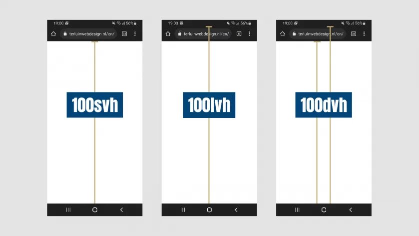
svh, lvh, and dvh
The svh (smallest viewport height) unit reflects the smallest possible viewport height visible to the user, excluding all interface elements. The lvh (largest viewport height) refers to the maximum viewport height visible to the user. And the dvh (dynamic viewport height) unit reflects the current viewport height, updating as the current viewport height changes.
svw, lvw, and dvw
Similarly, the svw (smallest viewport width) corresponds to the smallest possible viewport width visible to the user. The lvw (largest viewport width) refers to the maximum viewport width visible to the user. And the dvw (dynamic viewport width) reflects the current viewport width, updating as the current viewport width changes.
svmin, lvmin, dvmin, svmax, lvmax, and dvmax
Then we have svmin (smallest viewport minimum), lvmin (largest viewport minimum), and dvmin (dynamic viewport minimum) that pick the smallest value between the respective height and width units. The svmax (smallest viewport maximum), lvmax (largest viewport maximum), and dvmax (dynamic viewport maximum) do the opposite, picking the largest value.
vi, svi, lvi, dvi, vb, svb, lvb, and dvb
There are also new units designed to consider the directionality of the text. The vi (viewport inline), svi (smallest viewport inline), lvi (largest viewport inline), and dvi (dynamic viewport inline) units refer to the viewport’s size in the inline direction. Similarly, the vb (viewport block), svb (smallest viewport block), lvb (largest viewport block), and dvb (dynamic viewport block) units correspond to the viewport’s size in the block direction.
Finetuning Your Development Process With New Viewport Units
While the new CSS viewport units bring remarkable improvements, there are still some potential challenges when working with them. These challenges include the impact of mobile keyboards on viewport height units and the need for recalculations due to the inclusion of scrollbar’s width in viewport width units.
Solutions to these issues include using the Virtual Keyboard API to prevent the appearance of a mobile keyboard from changing the vh unit’s value, and creating your custom CSS variables that consider the scrollbar’s width when calculating the viewport width.
Conclusion
The introduction of the new CSS viewport units marks a significant milestone in the evolution of web development. By providing more precise control over viewport-based sizing and enhancing compatibility across different browsers and devices, these new units promise to streamline the web development process, offering a more user-friendly, efficient, and optimized experience for developers and users alike.
It’s important for web developers to stay updated and adaptable to these changes, constantly refining their skills and embracing innovations. In the dynamic world of web development, it’s not just about keeping up—it’s about setting the pace. Stay tuned with us for more insights and guides on the latest web development trends and innovations.